What is this?
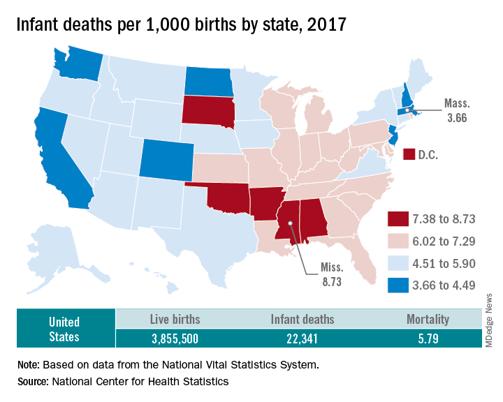
It is a map of the United States showing the infant mortality by state in 2017.
What are the names of the states in dark blue?
California, Washington, North Dakota, Colorado, New Jersey, Massachusetts, Vermont
What are the names of the states in dark red?
South Dakota, Oklahoma, Arkansas, Mississippi, Alabama
You should also note that Washington, DC is in this group.
Approximately what percent of the US population is born each year?
1%
The population of the United States is about 330 million.
Approximately how many deaths are there in the US each year?
About 3 million.
The key is to know that the fertility rate in the US is just above the replacement rate. Births are barely enough to keep up with deaths. This is common in Westernized countries. South Korea famously has a fertility rate of 0.8, well below the replacement fertility rate of 2.1. There were 2,813,503 deaths in the US in 2017.
What percent of the infants died in 2017?
0.579%
The mortality rate is per 1,000, while the percent is per 100.
When were these infants born?
Some were born in 2016 and some in 2017.
Infants are less than 1 year old. Some infants who died in early 2017 were born in 2016.
Based on the map, would you expect Pennsylvania or Tennessee to have a lower infant mortality?
Pennsylvania
It would be reasonable to expect that there is a gradual increase in mortality going from states with very low infant mortality to very high infant mortality. Pennsylvania is adjacent to states that have low infant mortality and Tennessee is adjacent to states that have high infant mortality.
This gradual change from one region to another is called the gradient. A gradient is like a slope on a curve, but often used on graphs with higher dimensions.
Which states have the highest and lowest infant mortality?
Mississippi has the highest infant mortality and Massachusetts has the lowest.
How many times greater is the infant mortality in Mississippi compared to Massachusetts?
2.39
What clue on the map suggests the variability in infant mortality between states may be related to state government policies rather than cultural or environmental conditions?
The disparity between infant mortality in North Dakota and South Dakota suggests that at least some of the variability in infant mortality is due to state government policies.
What are two ways that you might expect the states to be divided up into the 4 bins?
It would be reasonable to divide the range between the highest and lowest infant mortality into 4 even bins.
8.73 – 3.66 = 5.07.
5.07/ 4 = 1.27
This would give bins of:
- 3.66 – 4.92
- 4.93 – 6.19
- 6.20 – 7.46
- 7.47 – 8.73
It would also be reasonable to make groups of equal numbers of states. Since there are 51 states (including Washington, DC), there should be 12 or 13 states in each group (51/4 = 12.75).
Since the states were not divided using either of these methods, it is a good idea to:
- question what method was used to divide the states into bins
- consider how the map would look different using these other methods
- wonder if the data is being manipulated to either highlight or hide a truth
What might be a motivation for manipulating the data on this map?
The majority of the states in red lean Republican and those in blue lean Democrat. Red and blue are often used to indicate Republican and Democratic states. One motivation of the mapmaker might be to associate high infant mortality with Republican policies. If the bins were broken up a different way, then this association might be less obvious.
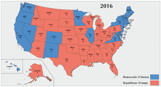
Compare the map above with this map of the 2016 presidential election results. The correlation is close but not perfect. It might look even less correlated if the bins were different.
Goals of this image:
- Know the names of states by their shape
- Identifying red states and blue states
- Understand the idea of a gradient
- Pennsylvania and Tennessee
- North and South Dakota
- Understand the idea of bins
- Watch for data manipulation
- The way the bins are divided
- Have some sense of population data and combine it with this map to draw new conclusions
- Size of US population
- Fertility rate

Leave a comment